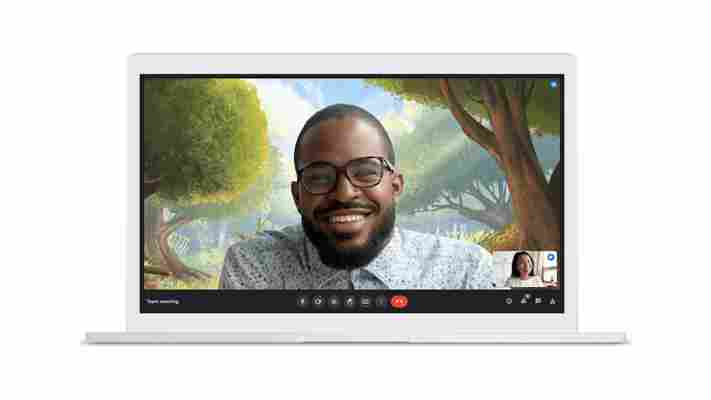
As we all continue to adjust to the increased number of video calls in our lives, Google Meet is introducing a bunch of new features to improve your meetings — and offer better competition to Zoom.

The company is tweaking Google Meet’s interface with changes “largely inspired by customer and user feedback.” These changes are rolling out to desktop and laptop users over the next month.
For one, all controls will be moved to the bottom bar, giving you quick access to all the features you need — a welcome change if you’ve ever had to do tech support for a family member not quite used to video calls.
Google will also give you the option to set your video as either a tile or a floating picture, giving you more options for your layout; you can also hide your own feed entirely. You’ll also be able to pin multiple video feeds at once, and when you unpin a presentation tile, it’ll be rendered the same size as other tiles, giving you more room to see participants’ faces.
To spice up your calls, you’ll soon be able to set a video as your background, as opposed to a static image. This feature will arrive “in the coming weeks.” Unfortunately, it does not seem you’ll be able to use your own videos at the time; Google says at launch your options will be “a classroom, a party, and a forest.” Alrighty then.
The company also wants to improve the quality of your videos by providing automatic exposure adjustment on the web; this feature had recently rolled out to Meet on mobile but is only just making its way to the desktop.
Another new AI based feature is the ability to automatically zoom the camera to keep you front and center if you move around a bit. Unfortunately, this feature will be exclusive to paid Google Workspace users.
Expect to see the new features roll out over the next few weeks.

